Pinterest, founded in 2010, is a global visual discovery platform serving hundreds of millions of users. Its hallmark grid layout—where Pinners browse, save, and act on ideas—has long been central to the experience.
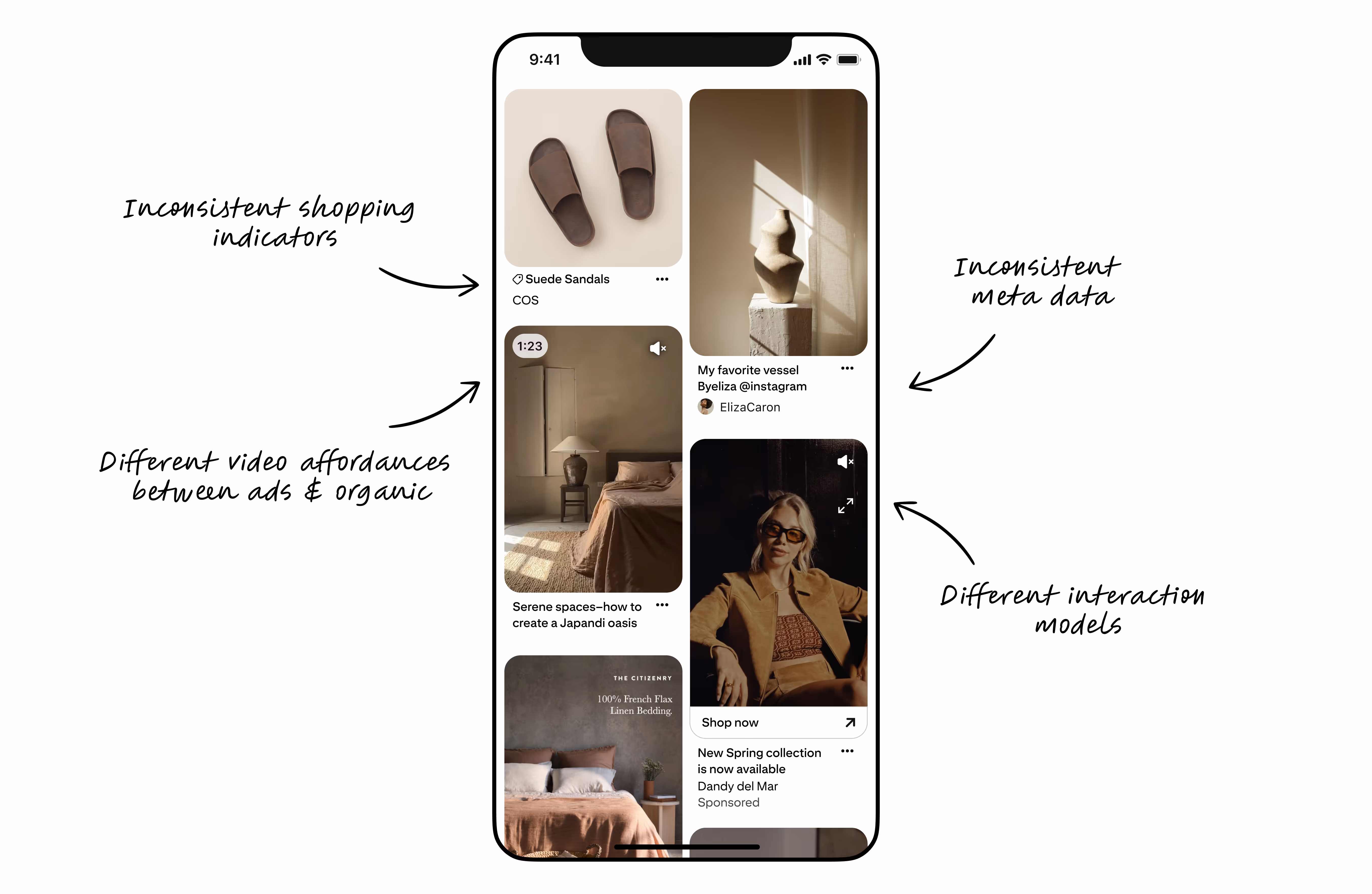
As Pinterest’s content and business ambitions expanded, the grid’s legacy design began to show strain: technical debt, inconsistent metadata, and fragmented overlays made it harder for users to evaluate ideas, and advertisers struggled to stand out without overwhelming the experience.I led the design direction for the Grid Initiative, as part of the Patterns team—a horizontal subsystem operating between product and system teams. Our mandate was to drive consistency, scalability, and quality at scale, aligning multiple orgs around a unified north star for the grid experience.
We began with a comprehensive audit and a cross-functional north star workshop to align on shared goals and principles. This set the foundation for a unified, modernized, and extensible system behind Pinterest’s most recognizable surface.
I structured the initiative into three iterative phases, each building on the last and leveraging the Patterns team’s horizontal reach to drive adoption and quality across surfaces while enabling us to have clear learnings along the way.
Phase 1 — Clean Up
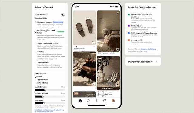
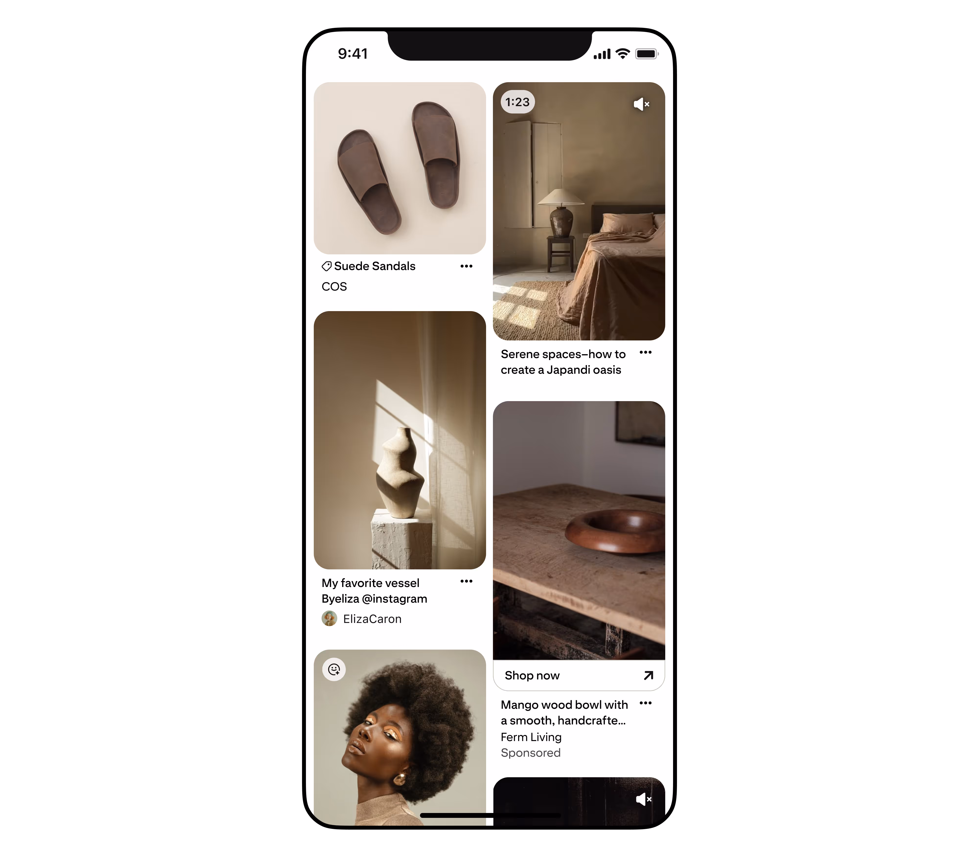
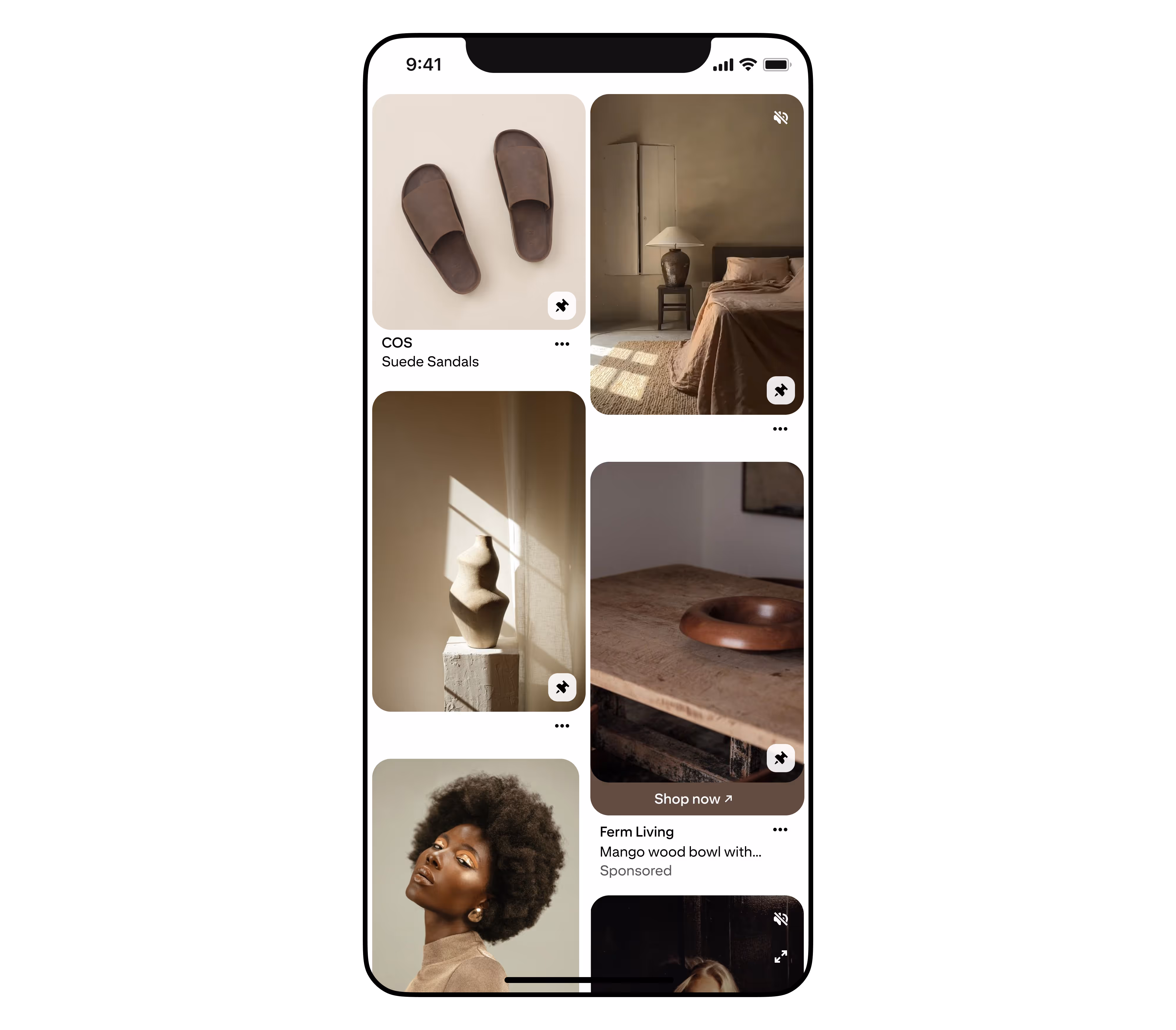
We removed unnecessary metadata, redundant elements, and outdated overlays, guided by new Grid UX Framework Principles centered on clarity, predictability, and actionability.
Phase 2 — Streamline Metadata & Indicators
We established a standardized metadata hierarchy for titles, brands, and prices, and created Figma libraries for rapid prototyping and team adoption. Patterns facilitated alignment through documentation, workshops, and a living design system reference.
Phase 3 — Bring Actionability Forward
We introduced Inline Save directly on the grid. This allowed us to model nuanced behaviors like “hide on dwell” (by using AI powered Figma Make prototypes) and balance user clarity with ad performance.
Each phase was validated through A/B testing, design QA, and cross-functional reviews, resulting in a framework, playbook, and governance model that became the new company standard for scalable grid experiences.
The Grid initiative delivered measurable improvements: impressions increased (+0.24% iOS, +0.69% Android, +1.31% Web), click-through rates rose (1.8% for ads), and cost-per-click dropped (2.5%). Title truncation and metadata standardization further improved engagement, while inline save drove increases in repins and revisitation—though it required iteration to balance impression losses.
Not all planned features shipped; some, like advanced shopping indicators, needed further investment. Patterns’ horizontal role and the new frameworks, playbook, and processes we introduced were instrumental in making these changes scalable and sustainable, setting a new standard for design quality and collaboration at Pinterest.