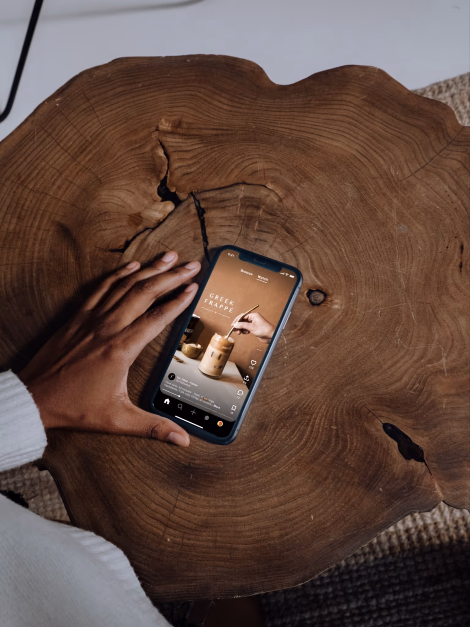
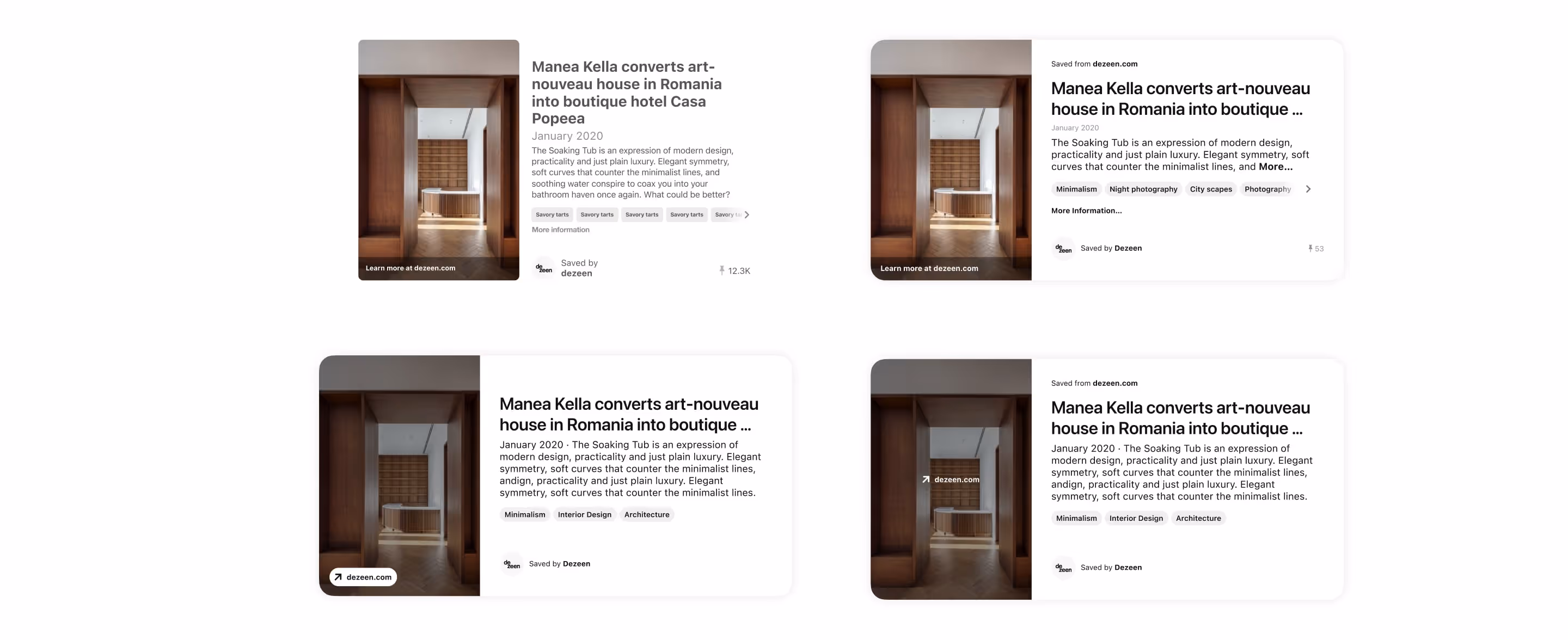
Pinterest began updating all of its surfaces in accordance to its new design system, which also served as an opportunity to assess all user experiences. Within the landing experience team on growth, we took a detailed look at outdated versions of detail pages, an important traffic driver from search engines.
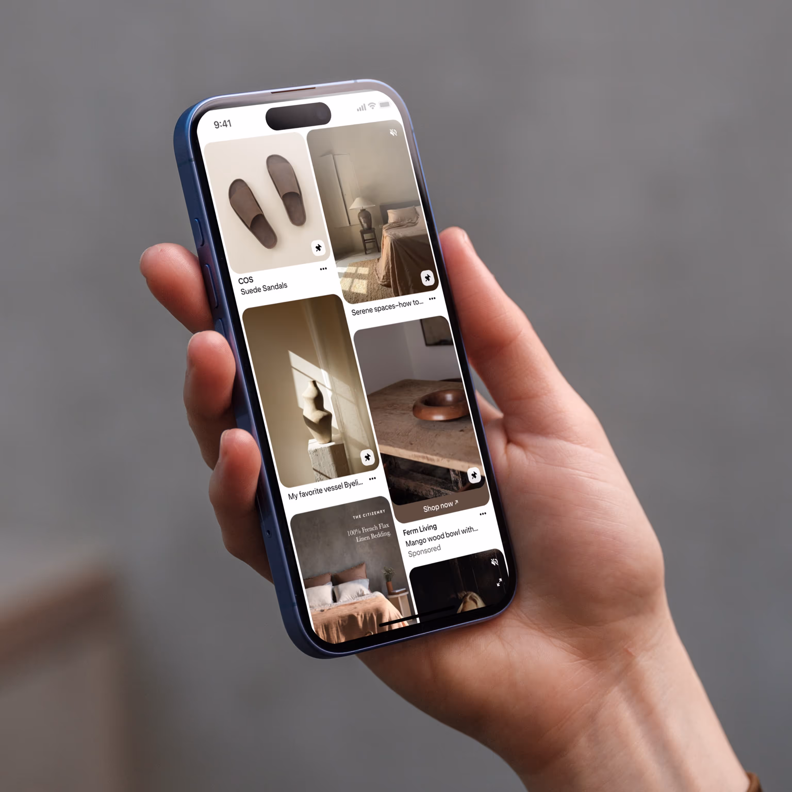
The existing pages were quite outdated and did not follow the latest UI guidelines, leaving existing users confused and giving new users the impression that these pages were not trustworthy. Additionally, there were substantial discrepancies between the designs of the pages when logged in versus not being logged in, creating comprehension issues and increased cognitive load.
We recognised a potential to merge codebases and reduce the amount of elements on each page, thereby improving upon page load times and driving metrics.
To get a better understanding of all the variables, we did a thorough audit of all the different components and attribution sources on both the logged-in and the logged-out experience of detail pages.
A main area we recognised needed further iterations on aside from the UI update was the suggested content that was displayed to users alongside the content they were originally looking for, which often left users confused. Recognising that even the smallest change could have a dramatic impact on our weekly active user base and sessions, we sought out to ensure that the UI was thoroughly tested to fully understand the impact of each change.
We conducts a multi-variant experiment, testing our core hypothesis of removing suggested content while also monitoring click-through behaviour with existing content.


The new focus Pin UI increased our weekly active user base substantially, improving page performance by 3% after removing additional content on the first renders. While we did notice a decrease in click-throughs by about 1%, we shipped the experience to provide users with a cleaner, more dynamic experience.